I have a confession to make: I’m something of a metrics junkie. I have lost entire days of my life just staring at Google Analytics reports. Metrics have always activated that same part of my brain that WoW did: ooh, a page view, ooh, a sale, ooh, if this had purple bars on it I’d pay $15 a month. So I would flip from email to Analytics to e-junkie (the extremely appropriately named payment processor I use) to Analytics to… and end up accomplishing nothing of real importance.
Because although I’m a metrics junkie, I’m a smart metrics junkie. And any smart metrics junkie can tell you that if your metrics aren’t giving you actionable insights to make decisions that matter to your business, well, you might as well go play WoW for all the good you’re doing.
That’s why, in one of my periodic bits of investing in the business, I built myself a dashboard.
Goals of the Dashboard
A dashboard is, simply, an easy to digest one-glance view on how your business is doing. Mine is implemented in Rails and it is the page that greets me if I visit my site (password protected, naturally). The purpose is threefold:
- Minimize the time it takes me to do common repetitive tasks.
- Show me information about my business at a glance, so that I don’t feel the need to log into my various other sources of info.
- Arrange for easy access to drilling down into important things for me.
Like all of my other software, it is a work in progress. (Incidentally, some folks have offered to buy it when I have mentioned it previously. I can’t sell it, since it is tied very tightly to my business needs and data available. At all of ~200 lines of code, though, you can knock one for yourself out in an afternoon.)
Here’s a screengrab from it:
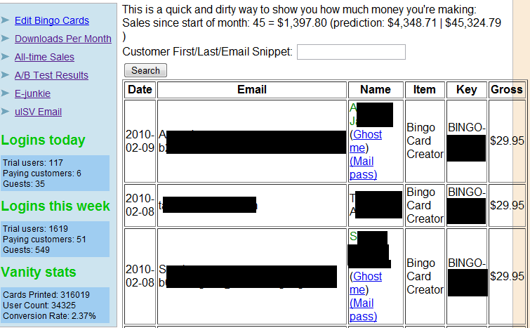
Some comments on what this shows:
Search box (“The Omnibox”): The Omnibox is my Swiss Army Knife support tool. Given absolutely anything I know about a customer — from her name to email address to transaction number to a (hopefully unique) phrase she has used in her bingo card — it goes off and fetches her customer record. This is a real timesaver because many of my customers don’t remember what email address they purchased the software under, told Google to obscure their email address (a misfeature in Checkout, if you ask me), purchased with their husband’s credit card, etc etc. The Omnibox saves me from having to actually do work to find customer records about 80% of the time. Search results are the same as…
Customer Entries (Latest First): The vagaries of the bingo business mean that I’m overwhelmingly more likely to get a support incident from you in your first 24 hours of use than at any other time. Accordingly, as soon as I open the dashboard, the last 10 customers pop straight up so I don’t even have to search for them. (This also serves as a quick visual health check and lets me see if a customer’s transaction didn’t go through.) This illustrates a core principle of dashboards: do less work, get more done. Ten keystrokes saved doesn’t sound like a lot until you’ve done it 200 times.
Customer Support Options: You’ll note some customers have their names in green. This means they are using the online version of Bingo Card Creator, rather than (or in addition to) the desktop version. Previously I just made that green to satisfy my curiosity (it gives instant, accurate visual feedback that 70% of my sales come from the online version), but as I got a feel for customer support needs I decorated their records with a pair of hyperlinks.
“Ghost me”: This is the same link you get if you try the Forgot Password function in the online app — one click logs you in. I right click it, select Chrome’s Private Browsing option (to avoid overwriting my cookie), and suddenly I’m you. This lets me see exactly what a customer is seeing, so that I can diagnose problems easier, or in a pinch just do what they need done.
“Email password”: The same as the password recovery functionality on my site — mails them a link to let them in so that they can change their password.
Sales Counter: This is only on the page because otherwise I’d a) log into e-junkie to check and then b) start trying to guesstimate how much money I was going to make this month. Both are bad habits. Putting it front and center decreased my logins to e-junkie from several times per day to once a blue moon (only when I need to speak with them, which since they run a very tight ship is “Almost never”).
Edit Bingo Cards: Takes me into the original core of the Bingo Card Creator site: a CMS which makes, you guessed it, bingo cards. This is where I approve work submitted by freelancers, make minor content edits to it, or create new bingo activities. Again, instant access on the dashboard saves time. (There are also a few affordances there, like AJAX approval so that all I have to do is mouseover a new card and click OK to approve it. Do less work, get more done.)
Downloads Per Month: This shows a graph of how many PDFs have been downloaded from my site, on a monthly basis. It is a quick one glance indicator of how effective my SEO is, from back when I didn’t have the user stats to look at. I could probably demote it from the dashboard these days. This information is public, by the way.
All-time Sales: Graph of sales by month. I mostly use this to check on market seasonality, year over year increase (70%, ho), and whether I’m on pace to make my revenue goals. This is also public.
A/B Test Results: If you’ve been around this blog much you probably know that I obsessively test and measure. When I have a particular A/B test on the front burner of my mind it gets promoted to the top of the dashboard. At the moment nothing I have running is super-critical so they’ve been placed a click away. You can see some of my A/B test results here — I’m a big believer in code reuse so a portion of my test results are also used for the documentation for my A/B testing library.
E-junkie: Convenience link to my payment processor, where I used to log into a lot. This should be demoted from the dashboard.
uISV email: The Google Apps for Domains email account I use. (uISV stands for “Micro-independent software vendor” — i.e. like “small software company” with a more pretentious acronym.)
Logins Today / This Week: This is my “one glance health check” for the business. I have a rough idea of what these numbers should be. If they go down far below that, I have broken the login button and need to fix it immediately. If they go high above that, it must be Halloween. If they stay flat I might have broken the login button close to Halloween.
Vanity Stats: I keep these around just to satisfy my primal WoW player urges. They have no particular relevance to my business, but they’re fun to quote to people.
You might think “conversion rate” is a really important number. See, conversion rate for a channel or a creative or a landing page is a very important number. Conversion rate for all of your visitors, on the other hand, is very, very sensitive to traffic mix. Since customers arriving by AdWords always outconvert customers arriving by organic search in aggregate (which is an artifact of my SEO strategy and not to be worried about), a gyration in conversion rate is generally caused more by a change in prospect mix than a strong reaction to a change in my product.
Things Not Pictured
This dashboard can potentially display a few other types of information. Thankfully, I don’t have an example to show you today.
Exceptions in payment processing: An exception happening in most places in my code is probably a misbehaving spider or a bug. An exception happening in the callback for successful payments is a bug. A very critical bug, because it often means that a customer loses access to the software they paid for. If that happens, the computer sends me an email, my cell phone gets rung, and this whole page gets hidden under a stacktrace written in blaze orange until I hit the “I dealt with it” button. (This obvious probably won’t happen if the whole site goes down — mon.itor.us watches that for me.)
Regular exceptions get written to my log files. That is, candidly speaking, where data goes to die.
Bug of The Day: I have a confession to make: I’m not much of a test driven developer. It is really, sincerely difficult to anticipate every corner case which could happen with customers trying all possible combinations of words and bingo card options. This causes a huge portion of the user-visible bugs in BCC, and because the symptom is typically “It looks… ugly?” (for a value of “ugly” not known at runtime) it is sort of hard to capture ahead of time in the predominant Rails testing frameworks.
That’s why I have a wee little daemon who periodically sanity checks all the print jobs people have run recently, looking for anything I’ve identified as the symptom of the Bug of the Day. Currently, the Bug of the Day is that under certain circumstances the combination of a very long title and a bingo card with four to six short words in a certain box can cause the box to render across multiple pages, which is not desirable. This is algorithmically checkable, but only in retrospect.
If the daemon detects that a particular print job caused one of the Bugs of the Day to pop up, it displays that fact in red, along with a link which copies the word list to my personal account so that I can reproduce the behavior and start trying to squash it.
This system also lets me sanity check upgrades to the site. If I cause a regression in behavior, typically (squashed) Bugs of the Day will typically resurface, and my dashboard lights up like a Christmas tree.
What’s On Your Dashboard?
I love hearing implementation details from other businesses, and this is about as wonky as it gets. What do you put on your dashboard? Do you have any suggestions for things I should consider adding to mine?